
Let’s face it, nobody needs any new Thanksgiving recipes. This is one holiday meal that people expect tradition. I can attest to this after years upon years of hosting. We used to serve a variety of different meal offerings that strayed from the traditional since neither Juancarlos nor I are fans of the usual Thanksgiving fare. Our guests enjoyed it all but one year they asked if we could serve a traditional Thanksgiving dinner. In our deep desire to be good hosts we heard their pleas and provided just that: Roasted Turkey & gravy, Mashed Potatoes, Cranberry sauce and Candied Yams. And because it’s us, we also served some of the non traditional items too: Sauteéd Garlic Shrimp, Buttered Fettuccini, etc. Guess what? Everyone devoured all the non traditional items and we were left with tons of the traditional Thanksgiving meal. I probably don’t need to tell you that that was the last Thanksgiving we hosted.
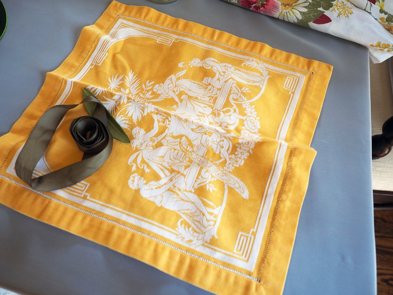
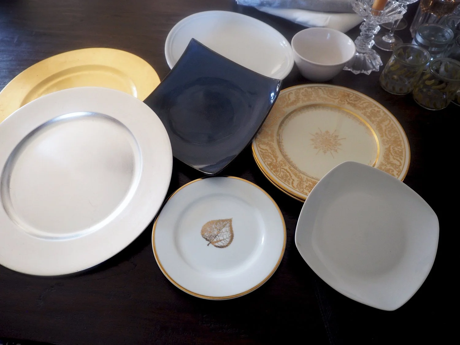
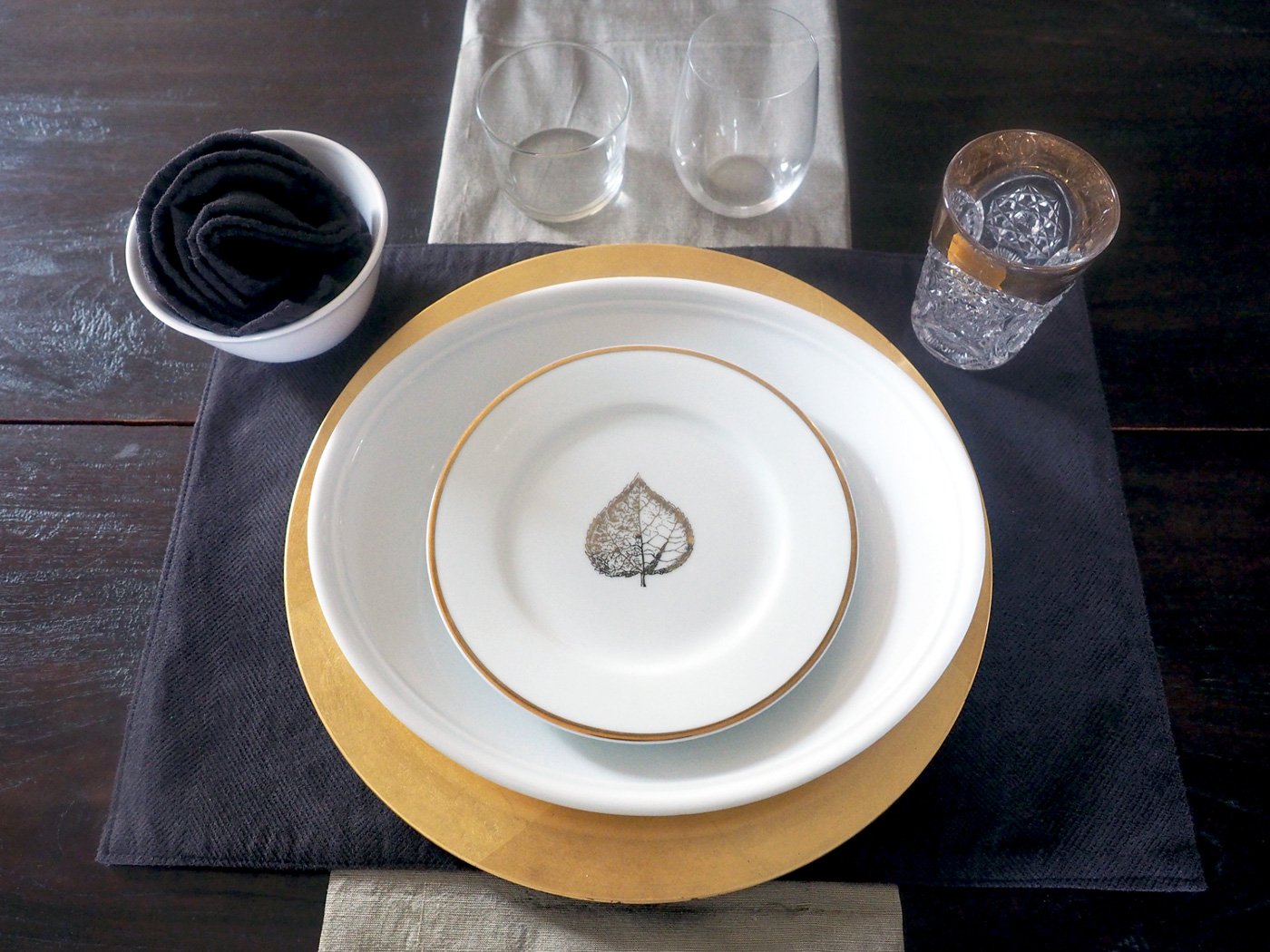
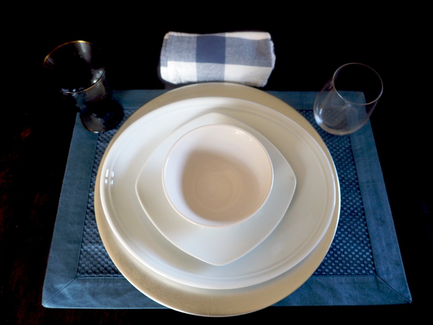
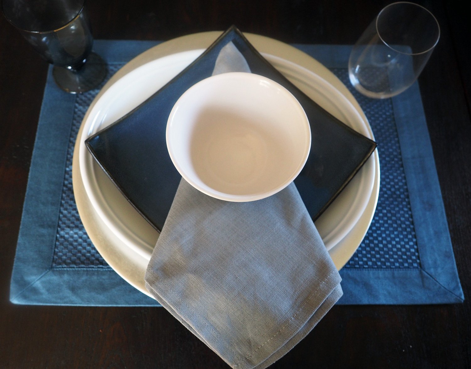
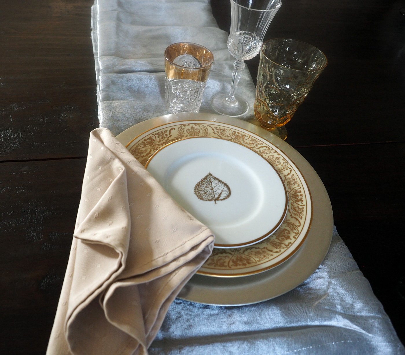
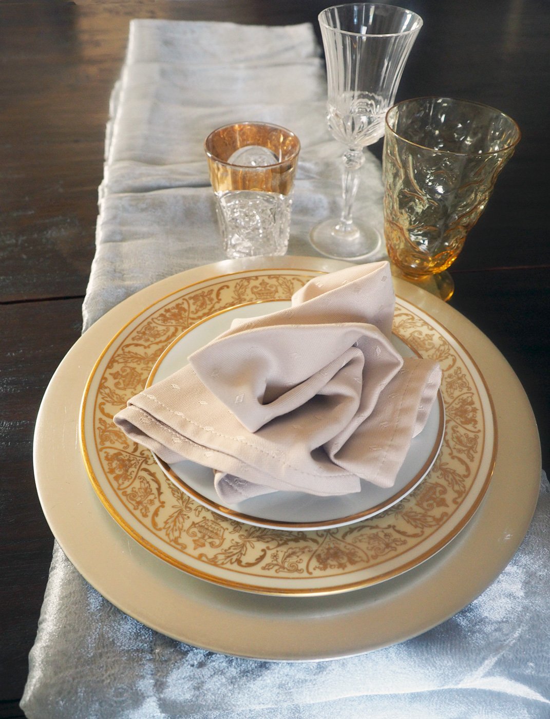
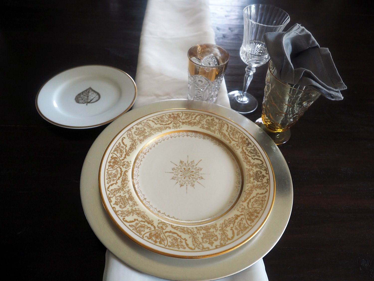
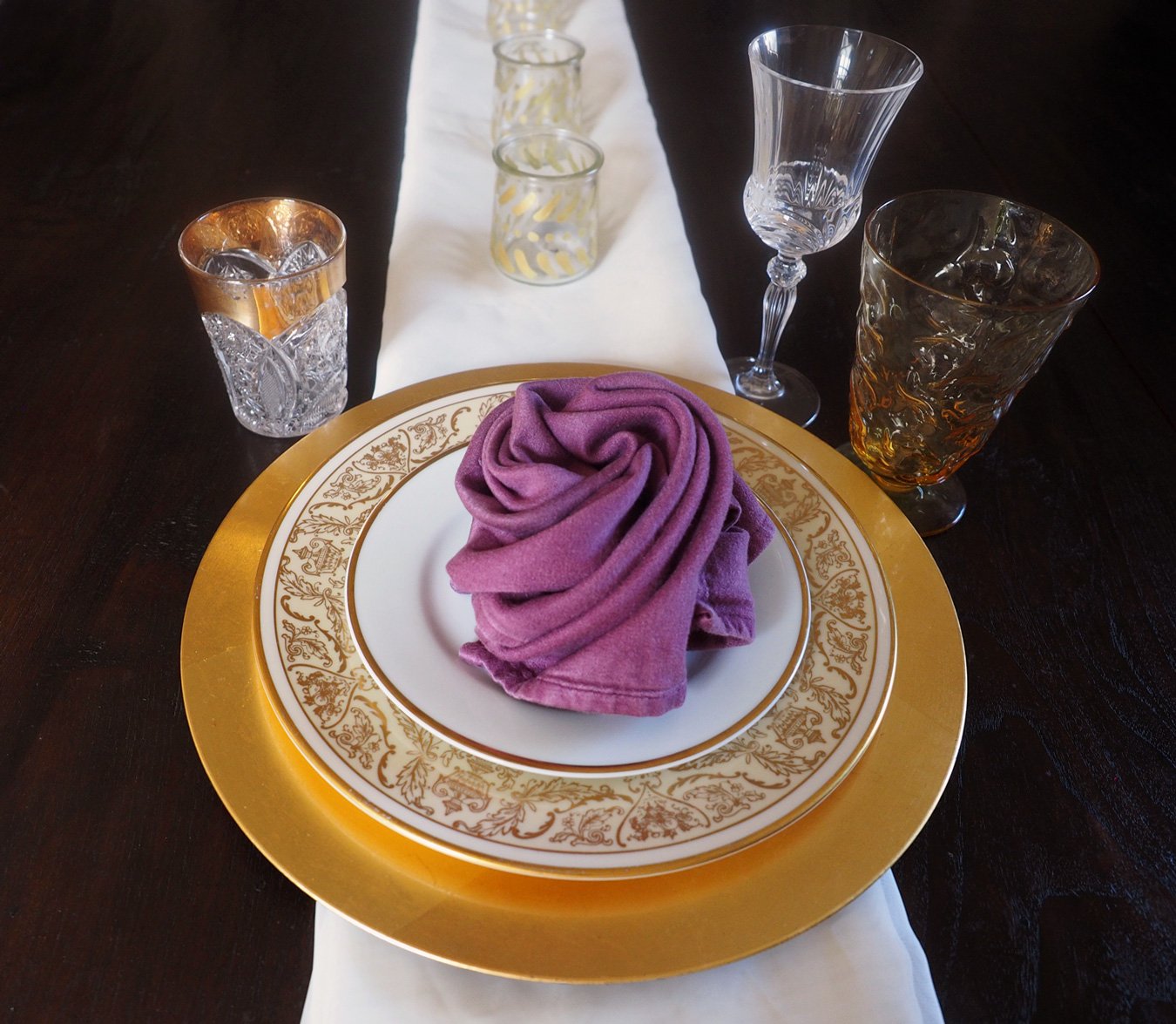
So, after a long winded explanation as to why I’m not posting a recipe, the next best offering is table setting ideas. I recently picked up some new linens. And when I say new, I mean new to me as these were thrift store finds, of course. I pride myself at tracking down rare treasures. A perfect example are the three dishes below. Each one found in different thrift stores, in different years, in different towns. And yet, somehow they all work harmoniously together.

Plate of yesteryear gracefully finding a new home.
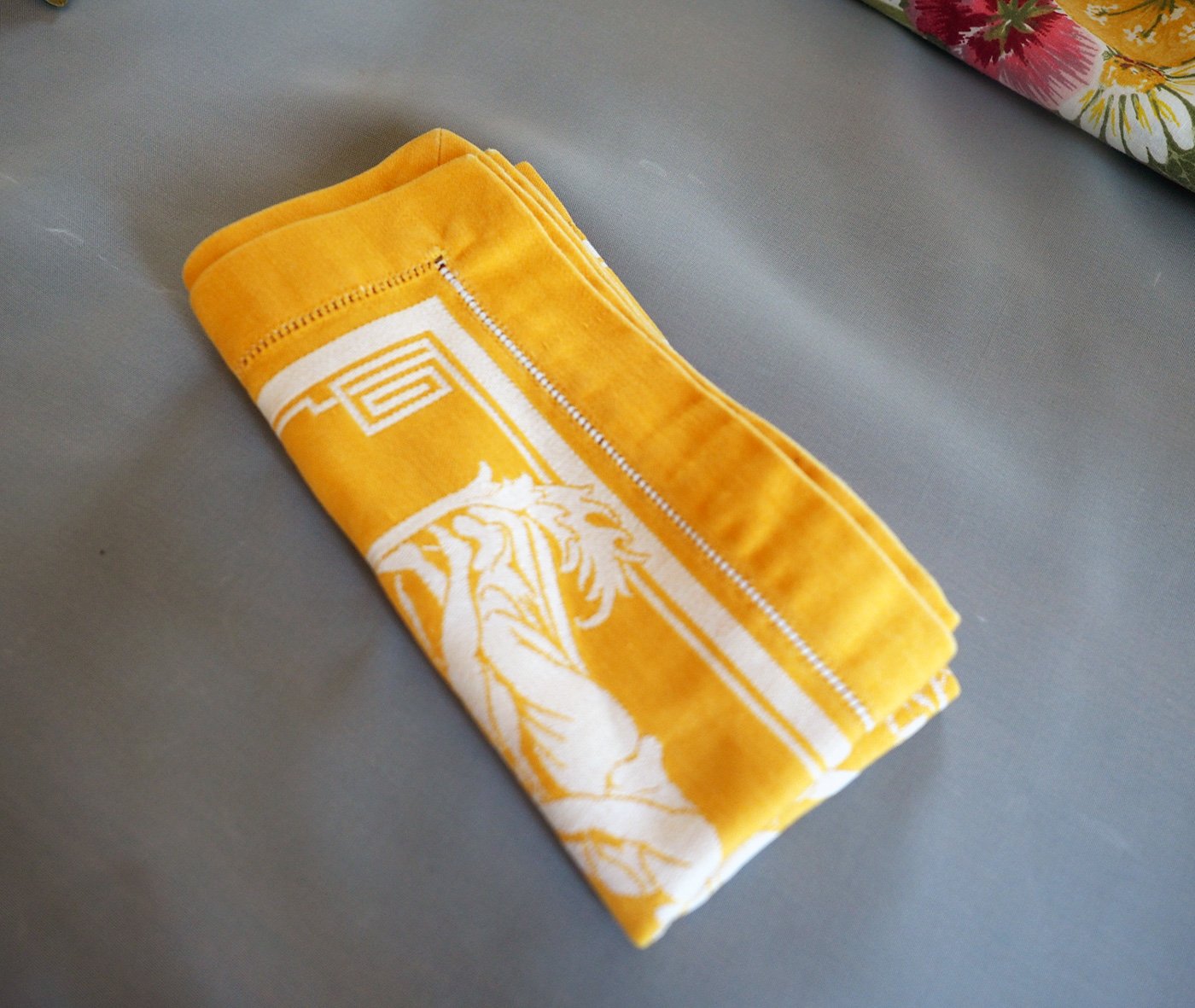
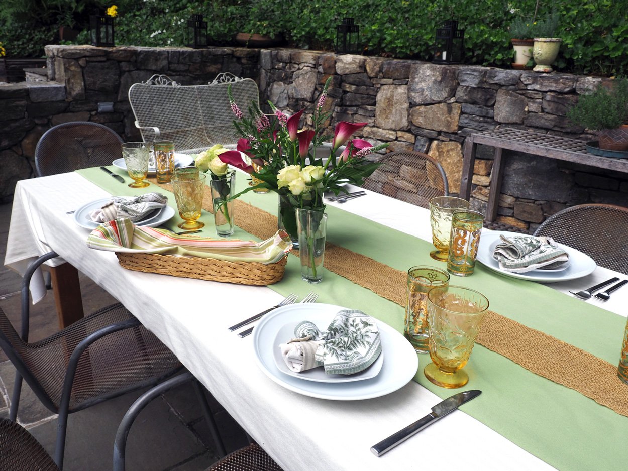
I decided to lean into the soft browns of Fall to create a quiet, more subtle toned table scape. Maybe it’s how my heart feels these days, soft, peaceful and in need of quiet calm. I had some mix and match ideas in mind, but instead of overwhelming you with too many options I will keep it to a few. Naturally, you can mix and match to your hearts content with the linens and dishes you have on hand. I had two tablecloths with several different napkin options, and one runner.

The above line up… pre-ironing.
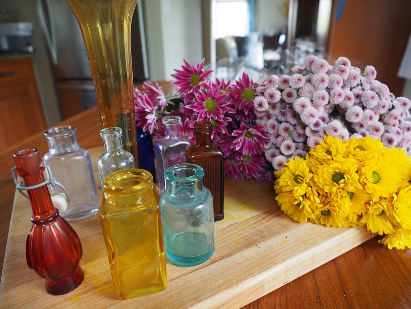
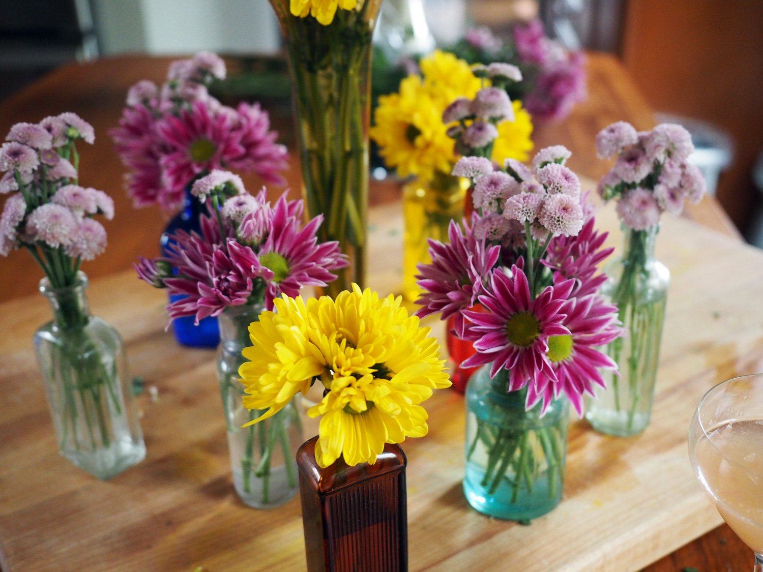
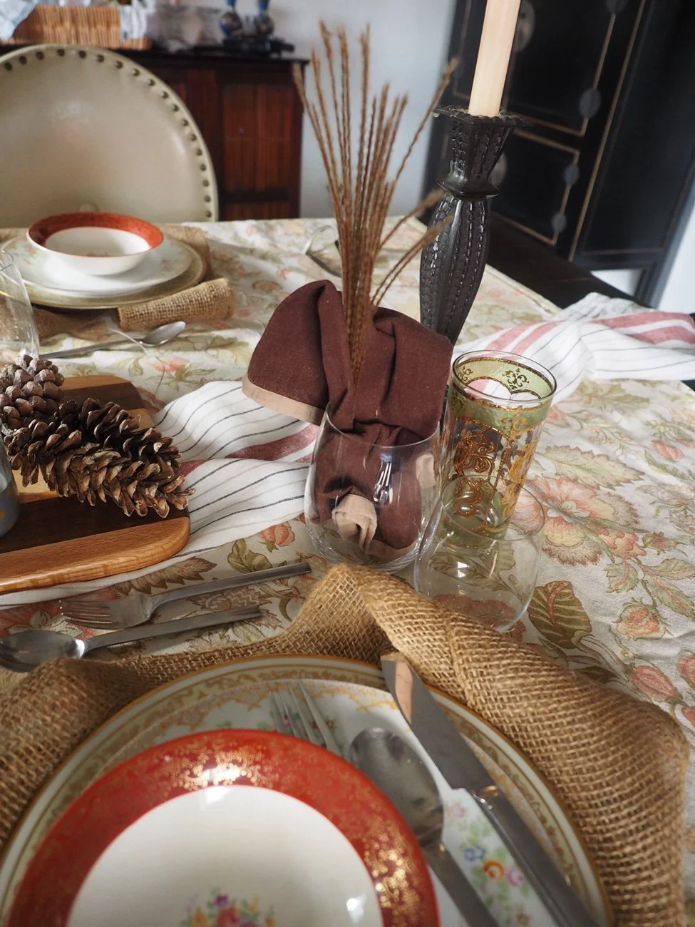
When it came time for florals I had been scheming for weeks about creating a whimsical display using only a variety of wild grasses that grow on the side of the road. But every time I passed them, I was scissor-less, and then time just plum ran out. So I did the next best thing… walked around my yard - with scissors. Both centerpieces are made from stems I cut from our garden. Well, and maybe a few from a nearby park. Shhh, no one was looking. The most important thing was not that I clipped someone else’s branches, but that you don’t need to spend a dime to create something impactful. I created two centerpieces. One tall, while the other was long, and low.

Using a brown ceramic vase with 5 hydrangea blooms, several maple leaf branches and few grass sprigs created a burst of Fall.

The long wooden tray is one of my favorite pieces that I inherited from my mom. My parents brought it back from their honeymoon in Mexico. So besides being old, it’s unique, versatile and has a tray load of meaning. I placed the center candlestick in the middle, added a bark-less tree limb and then tucked in the tree branches and grasses to create a long, low centerpiece.
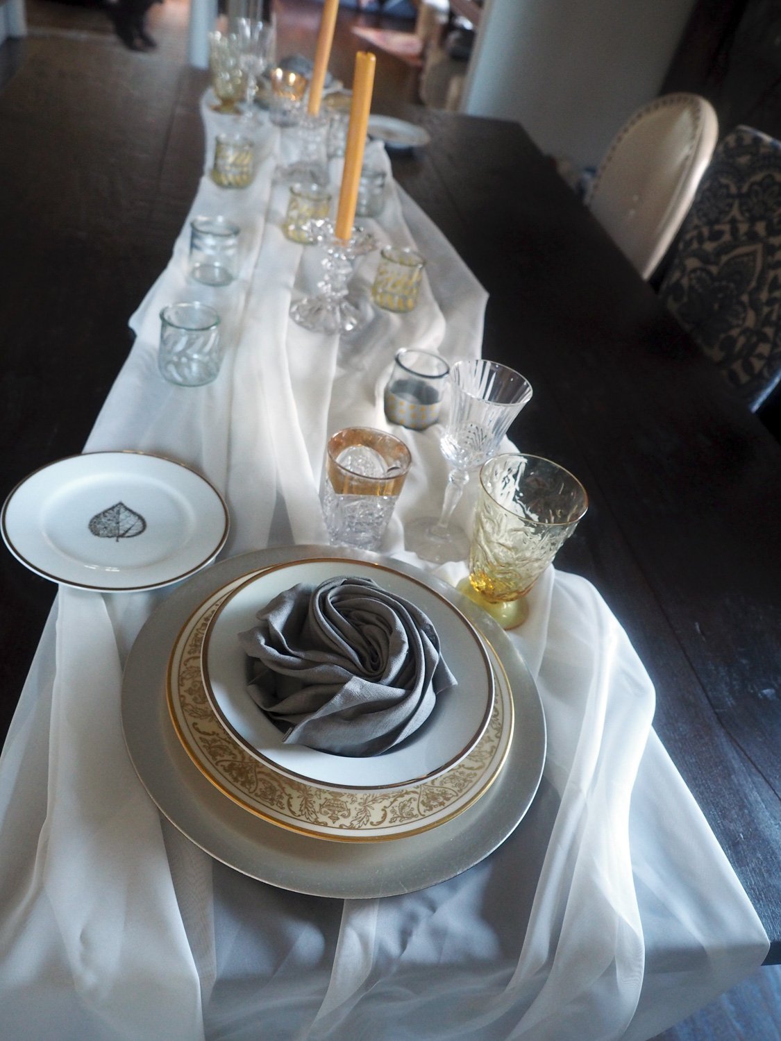
Let’s set the tables. That’s to say; one table but with two different looks. I promise I’m not going to drive you crazy with countless options. Sometimes, I even annoy myself.
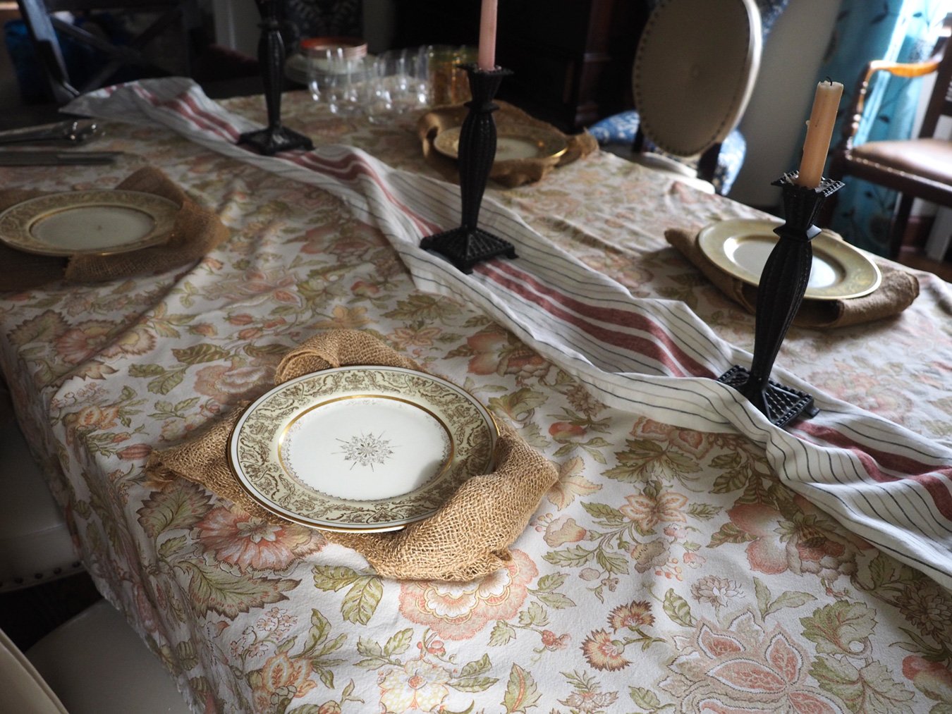
The first table is truly soft brown tones with a long, low centerpiece. The line up:
Tablecloth of muted brown, soft orange, green tones
Table runner with black, beige and brown stripes
Brown cotton napkins
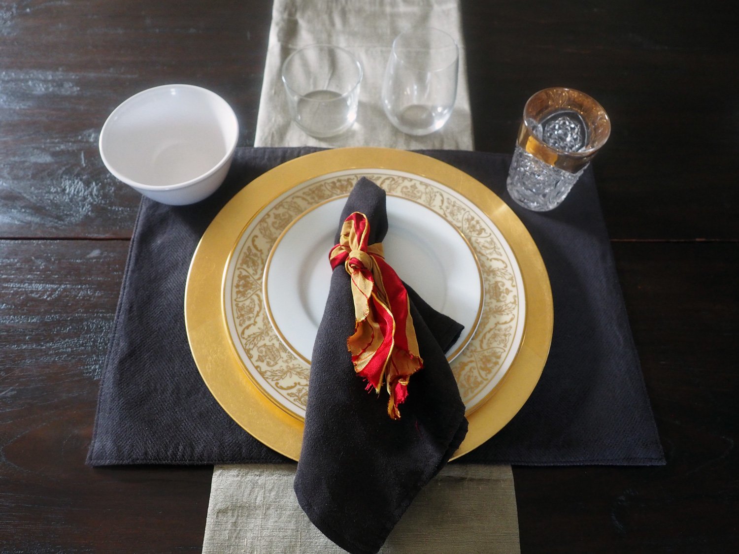
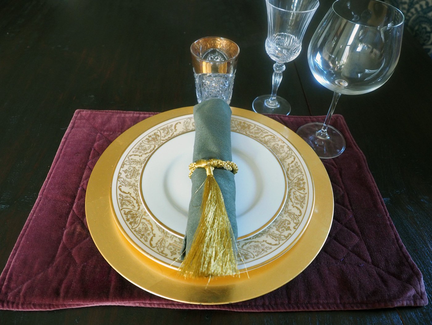
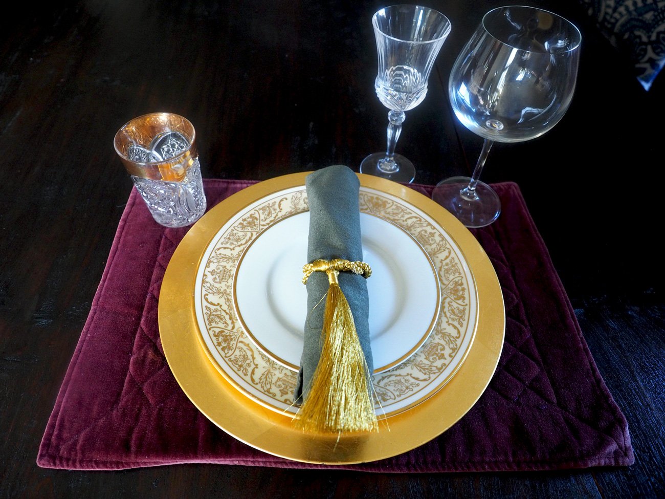
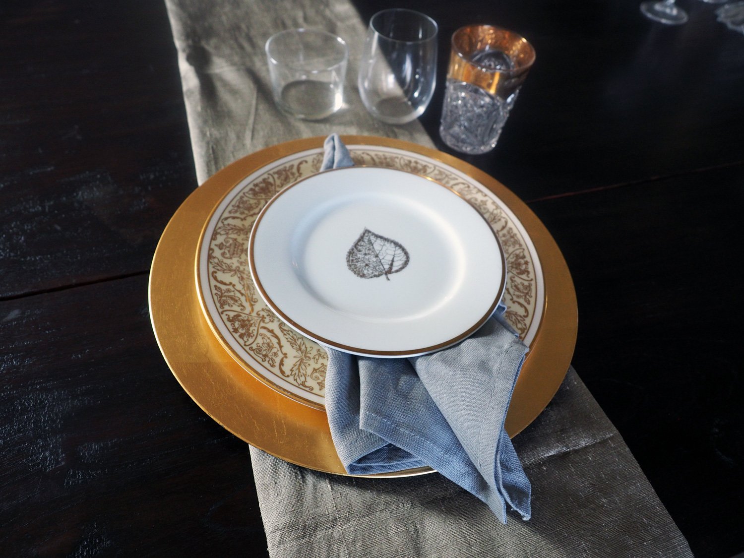
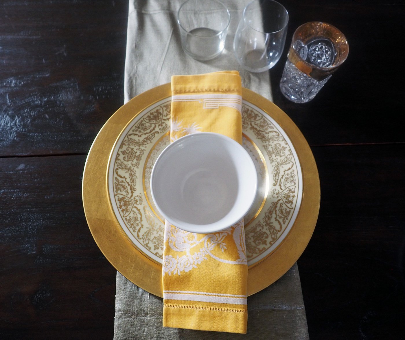
Plates: Gold trimmed dinner plates, floral salad plates, burgundy floral soup bowls
Glassware: stemless red wine, stemless white wine, green & gold water glasses
Brown iron candlesticks
Burlap wrap (not in below photo): to be used as an organic placemat

The line up of dishes, napkins, tablecloth, glassware and runner.
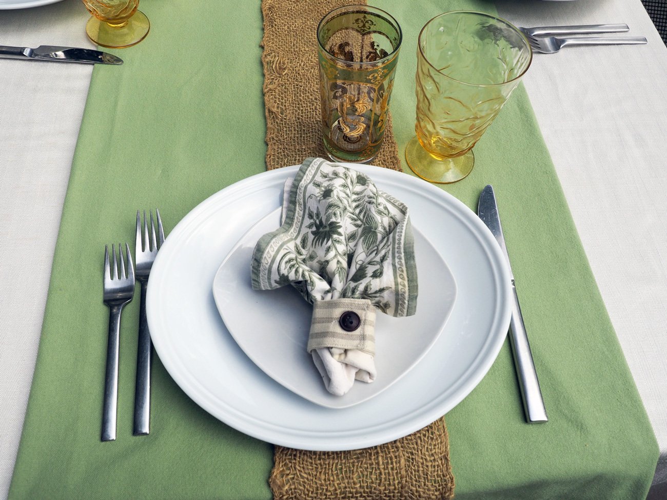
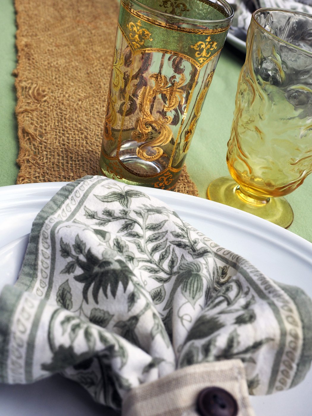
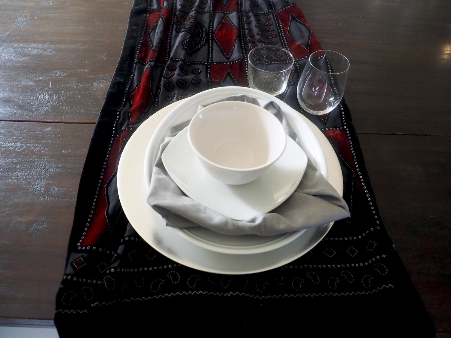
To start, just layer in the above items. Here’s how I laid out mine with one twist at the end for non conventional silverware placement. Note: after putting the plate down without a charger or placemat I felt the dishes needed a landing spot. So I grabbed some burlap wrap and laid it down in an organic bunch, then placed the dishes on top.
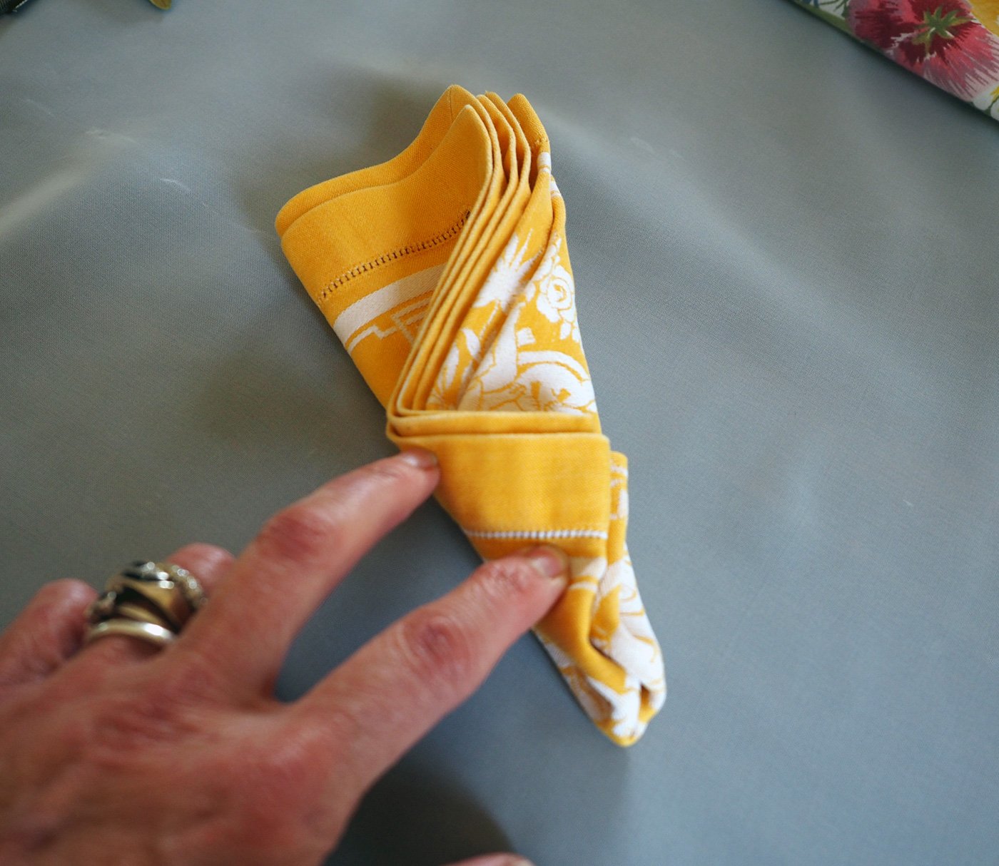
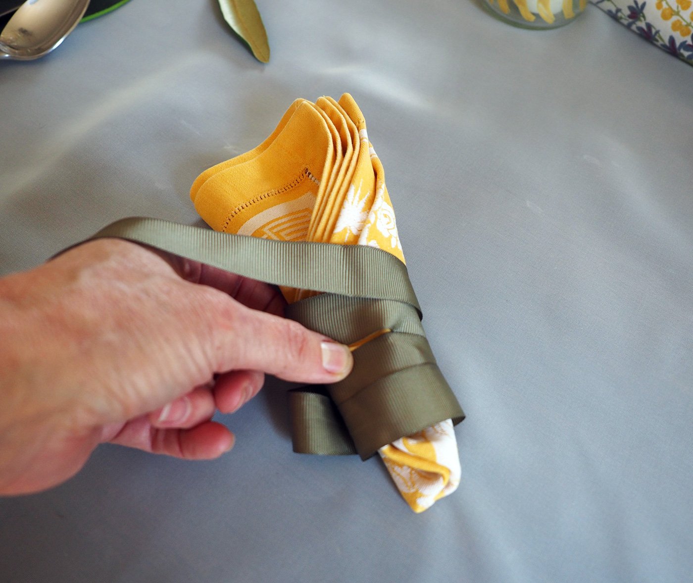
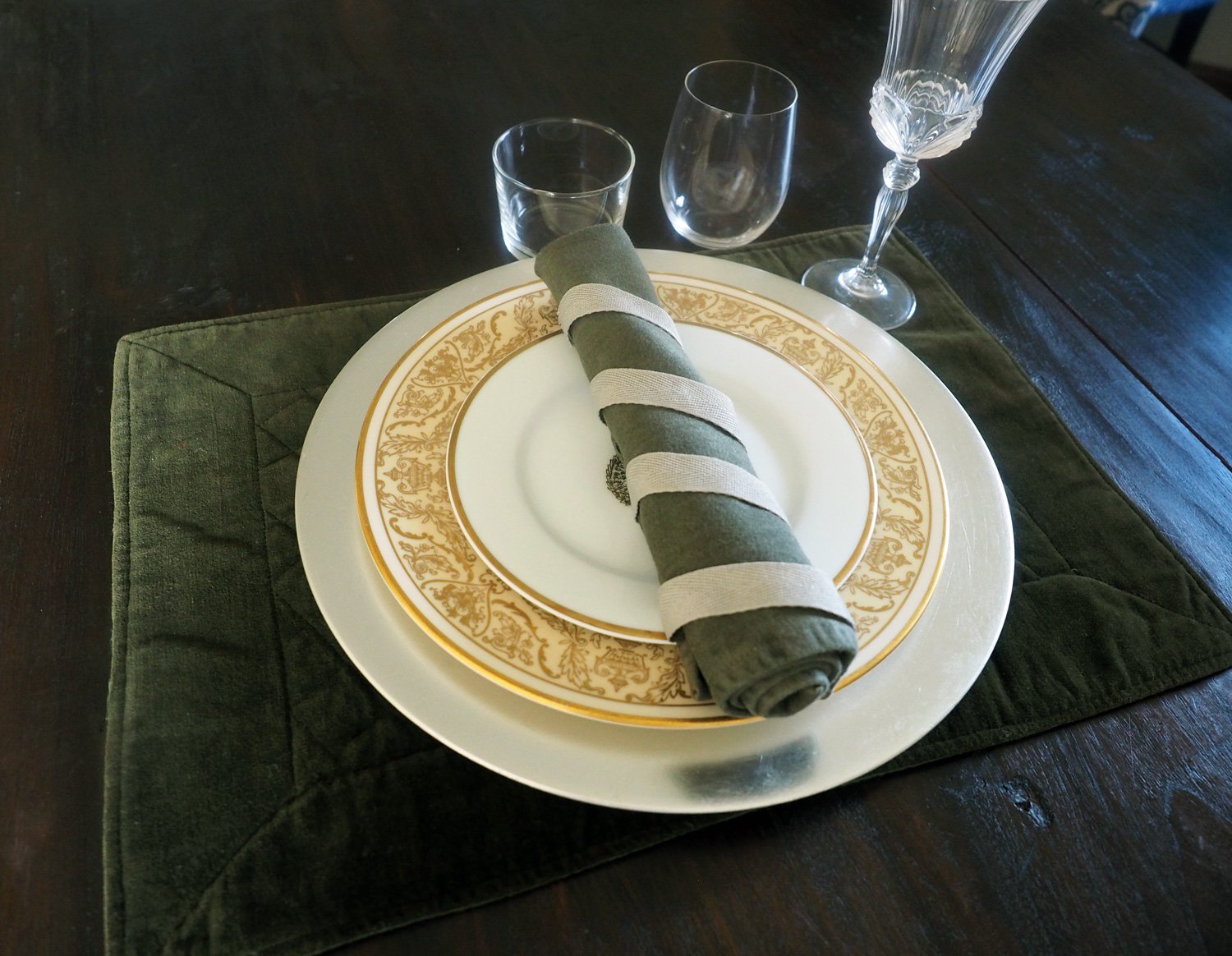
Then the runner, candlesticks, silverware atop a simple napkin fold. Fold it in half lengthwise, and then again. Place to the right of the plates letting the bottom 1/3 hang over the table. Line up your silverware, then fold the bottom 1/3 up to create a pouch. Add a single sprig of grass.
Place the red, white wine glasses with the water glass to the right, and the dessert spoon above the plate.


Add the centerpiece, and call it done.

The centerpiece mimics the tablecloth pattern which is a happy accident because when I was in the park cutting branches I just cut what drew me towards them.

Nature in all its beauty and glory. This is nothing more than some random leaf branches and grasses.
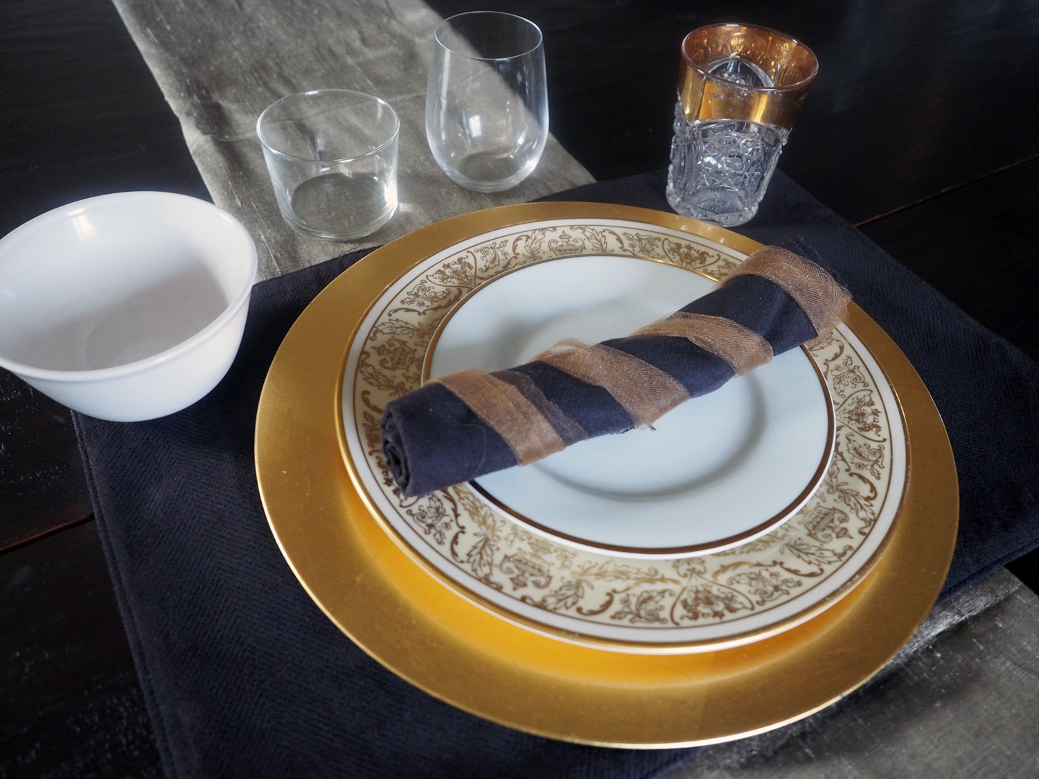
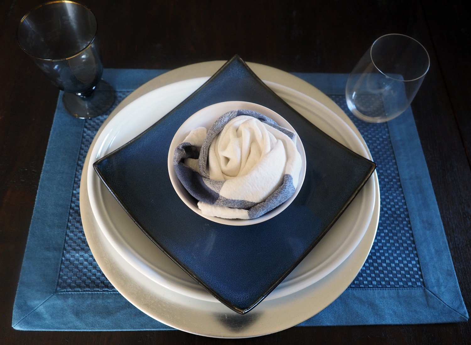
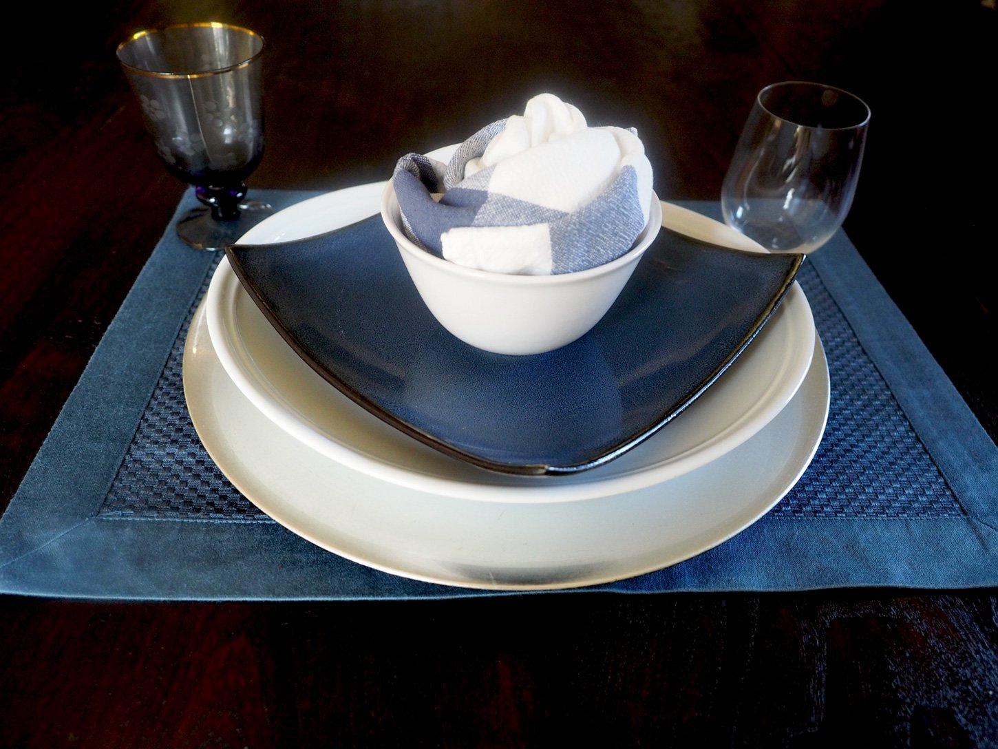
And now for a few alternates. Push the soup bowl to the left and place the silverware directly on the plate. Place the napkin and grass sprig inside the wine glass. And lastly, you can swap the low centerpiece for the taller one.


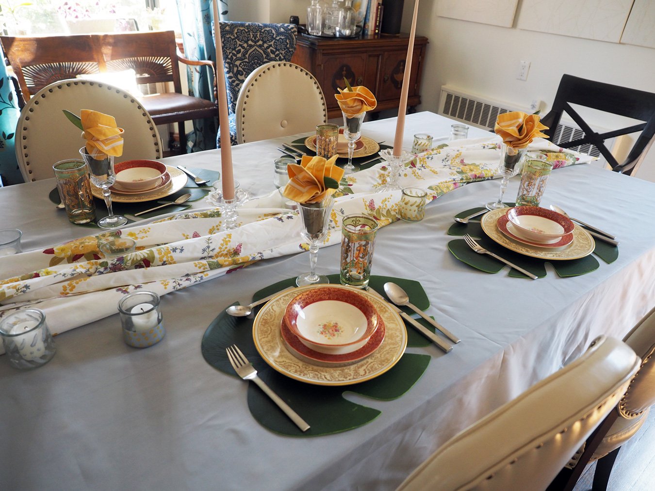
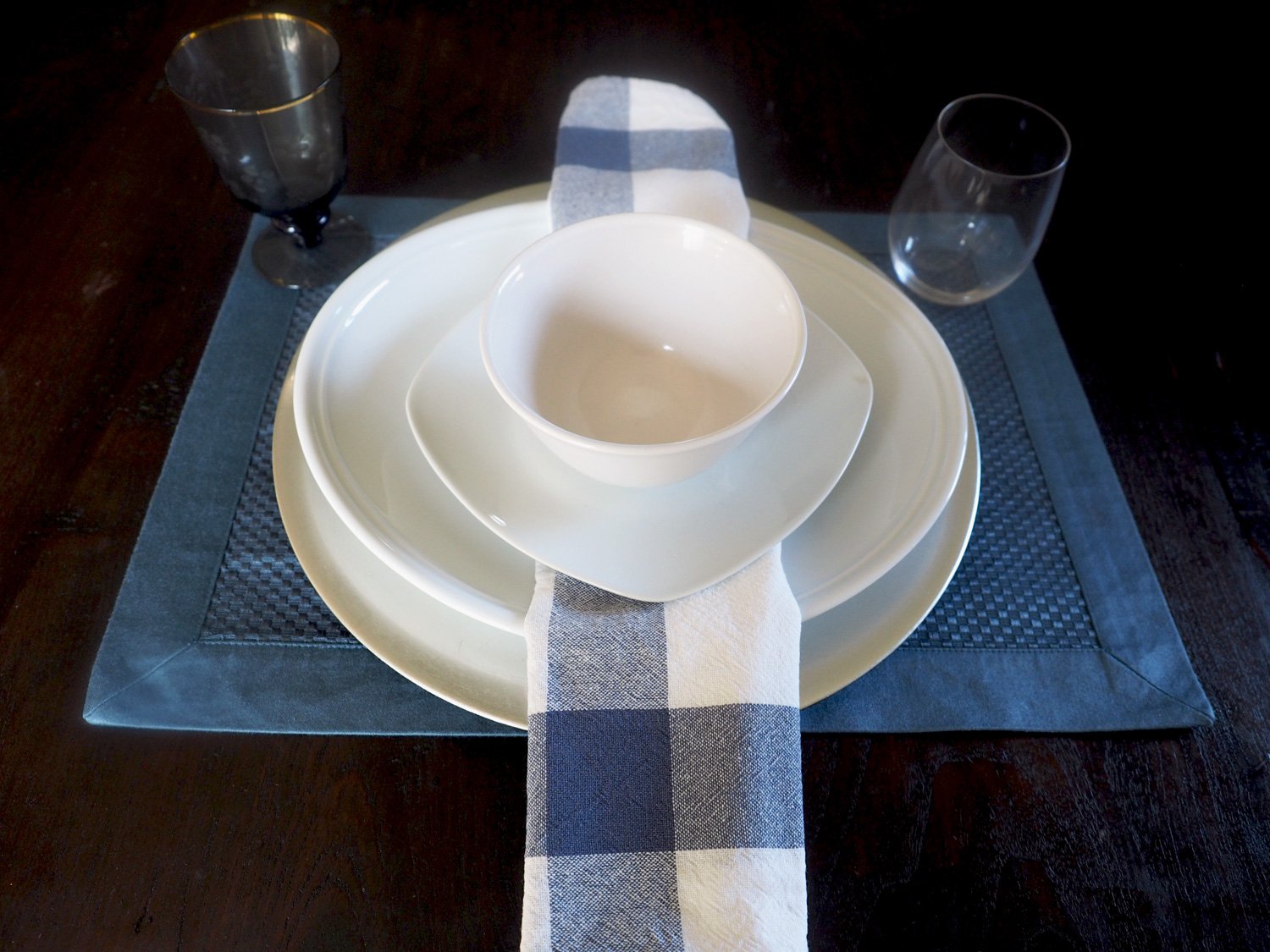
Onto table number two. Here is the line up:
Burnt Orange/Brown tablecloth
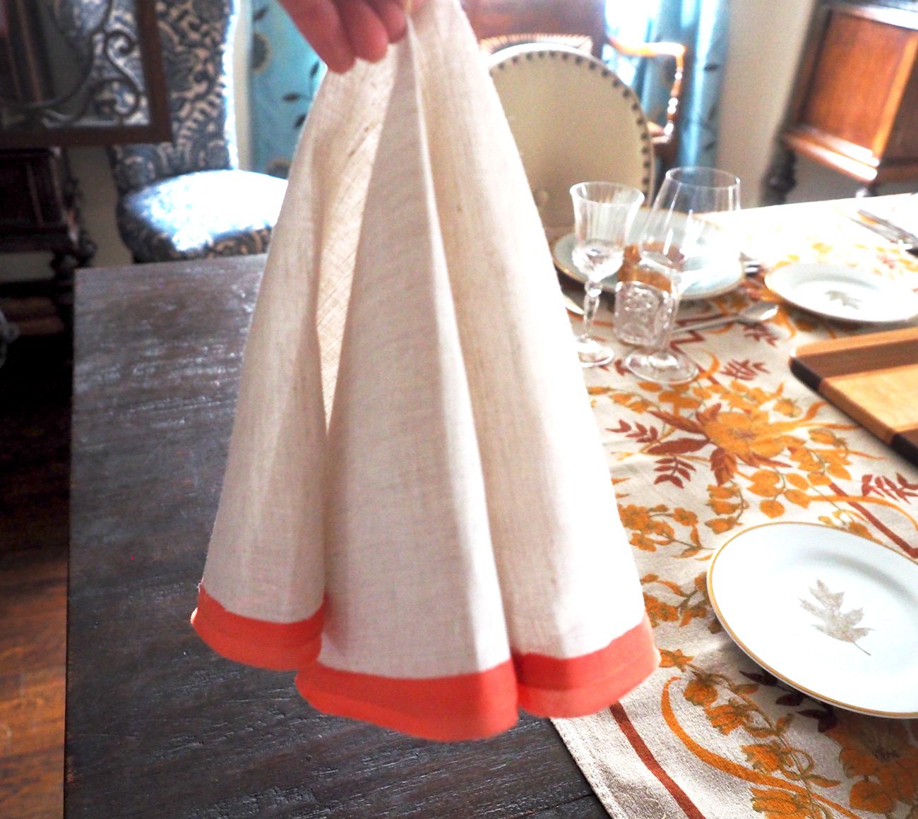
Taupe Linen napkins with orange border
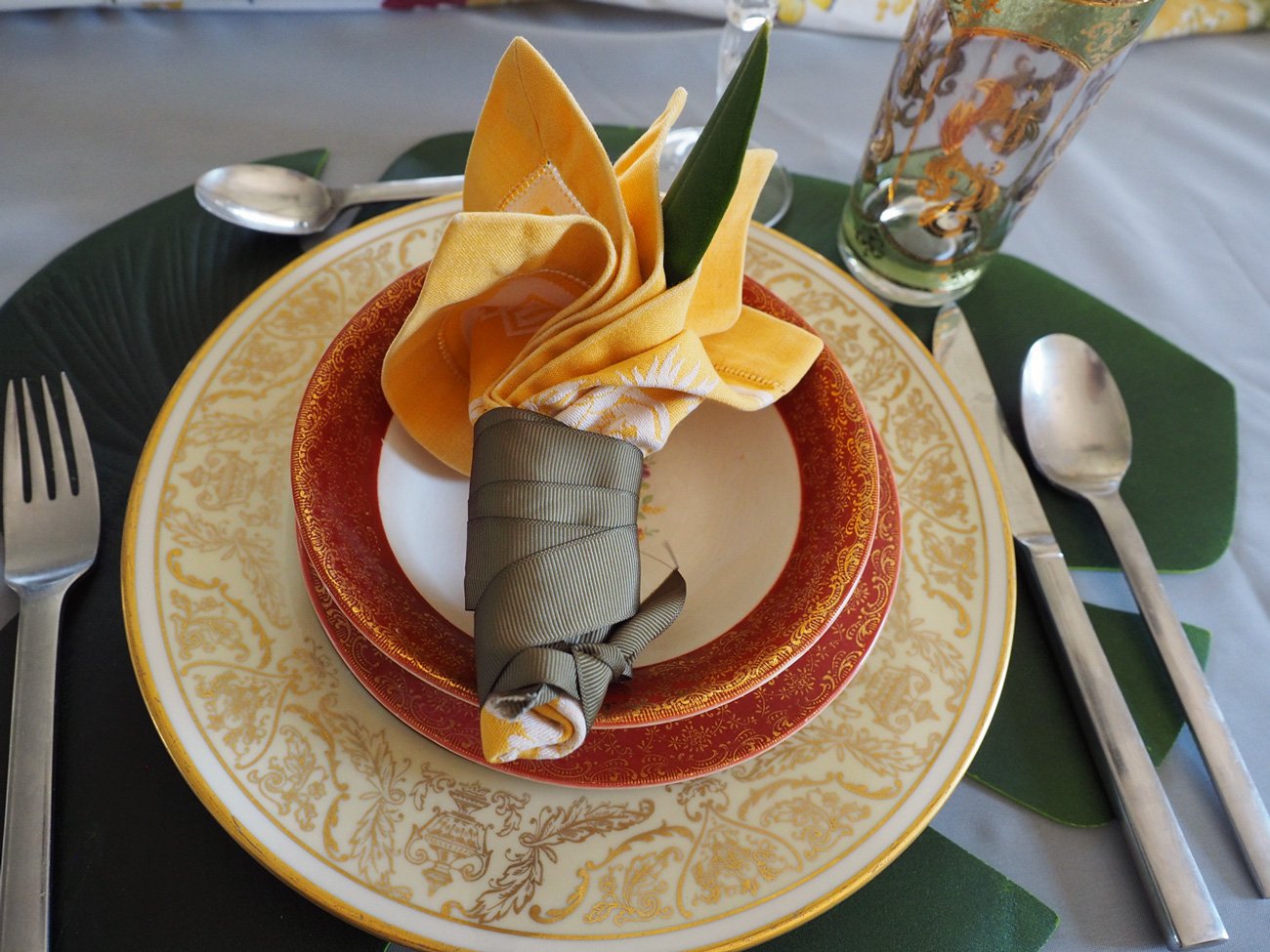
Gold rimmed plates, bowls
Stemmed red & white wine glasses and gold rimmed water glasses
Wooden board for centerpiece
Silverware

The line up for a table with more orange than brown.
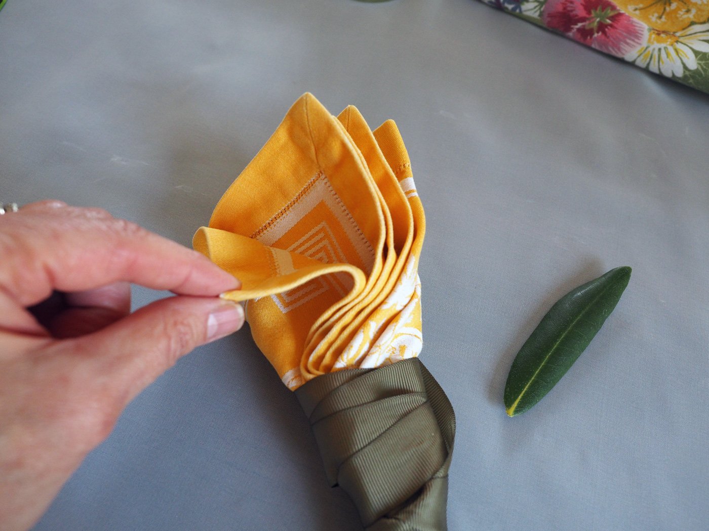
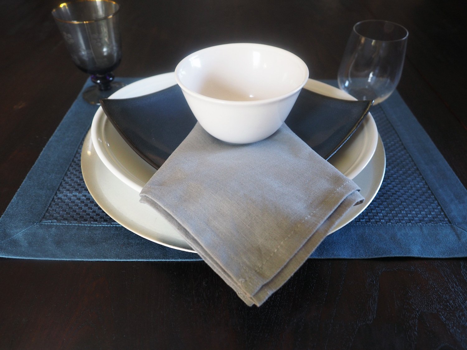
Ok, you know the drill. Start the layering all the elements. The napkin isn’t a fold as much as a natural falling with folds. To achieve this look simply grab the center of the napkin allowing the natural folds to occur. Then place it on the soup plate and adjust as needed to create a natural 3 folded effect. If you need more napkin ideas check out my post 5 Folds - Countless Options


Once you place the florals on the center of the wooden board, fill in with candles and some pine cones. The wooden board not only plays into the brown theme but also makes it easy to remove if you prefer putting your food platters on the table.

Nothing store bought, just some fall foliage in a vase.

Pine cones and candles round out the centerpiece.

As i mentioned, my original centerpiece ideas was natural, beige grasses. So this pop of color was unintended but ended up working well.
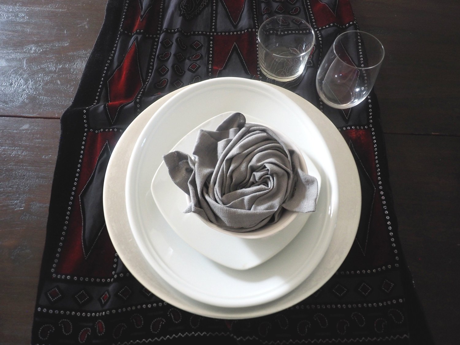
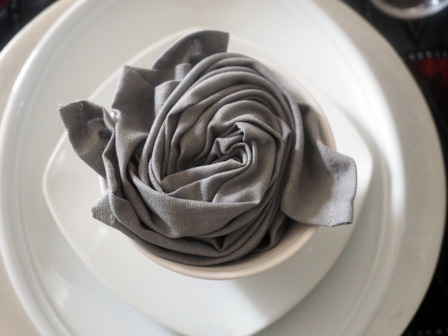
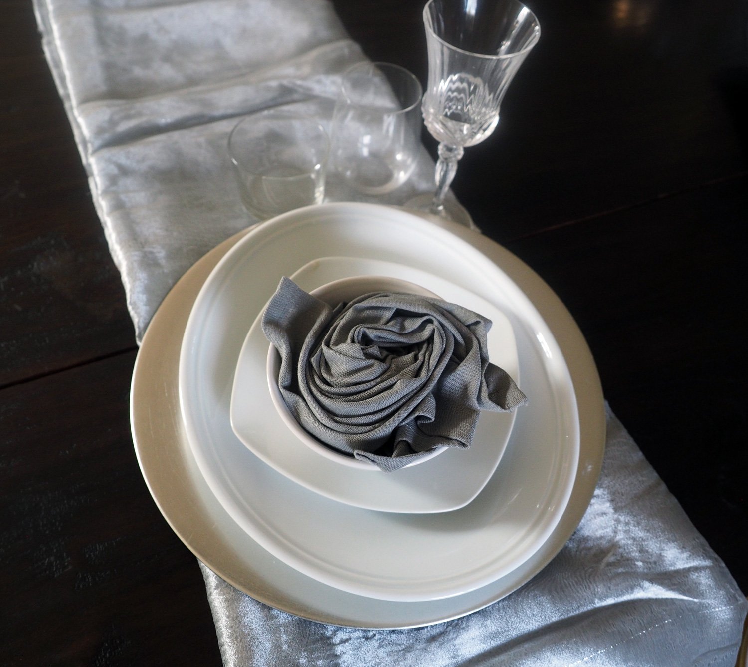
Now for the last swap out. Switch the taupe linen napkins for plaid ones swirled into a rosette. Change out the gold rimmed water glasses for golden yellow goblets, and the stemmed white wine glass replaced with stemless.
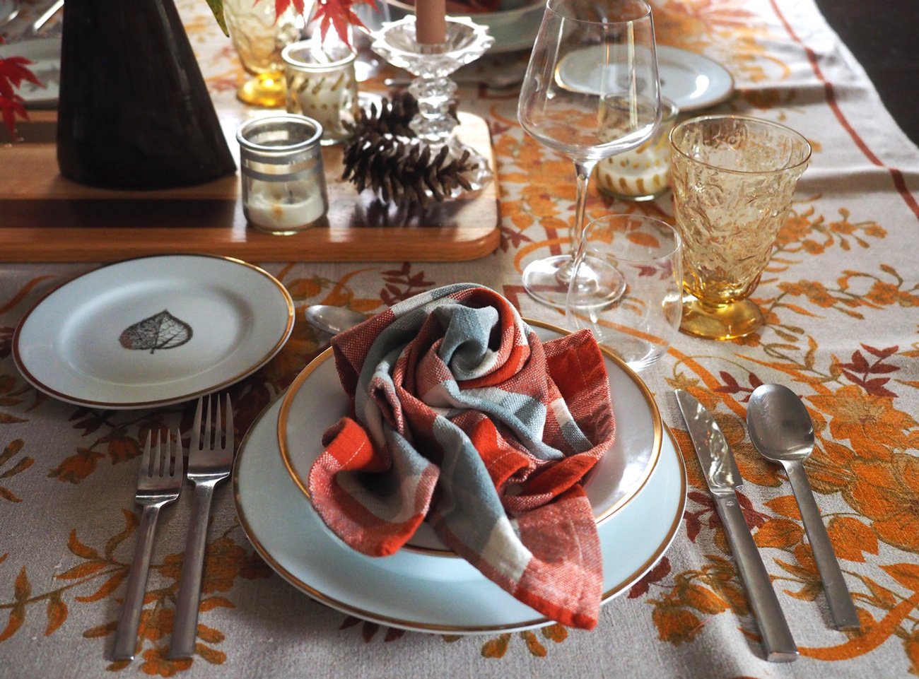
Plaid napkin in rosette bundle. Gold rimmed water glass swapped for golden yellow goblet, and stemmed white wine glass replaced with stemless. To create the rosette effect, check out the video in my blog post about Table Settings - A Multitude of Options

I hope the browns were soothing. And as promised, I didn’t go nutty with variations, but hopeful gave enough for you to create your own festive table-scape. If more options are your jam, then check out a past post that offers variations on the variations! Thanksgiving Table Settings - Casual to Elegant
Happy Turkey Table Dressing!