
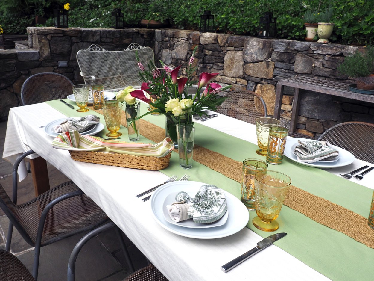
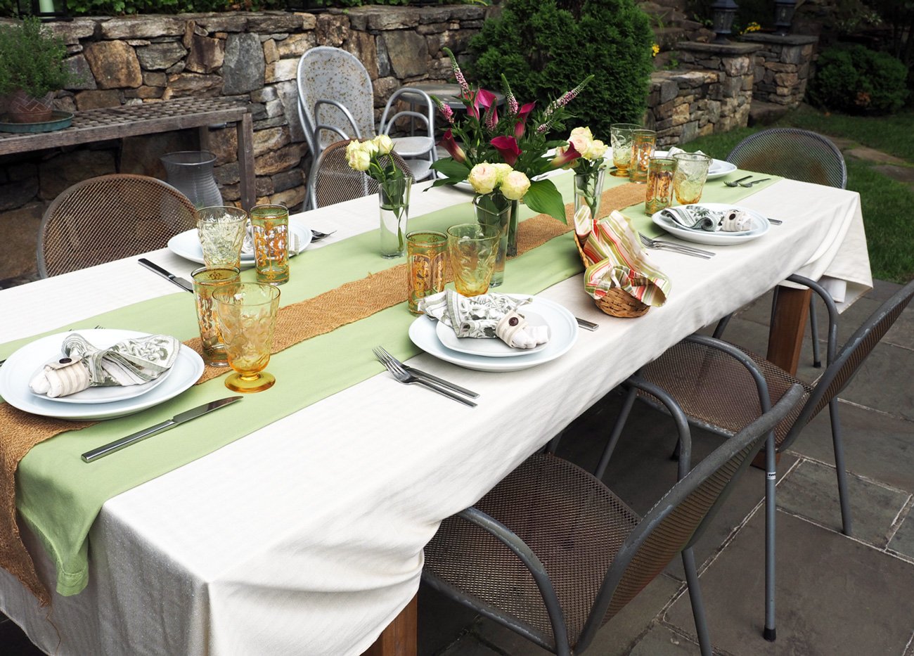
There is something so soothing about cream colors. Just the word puts me at ease. Which is why I choose it as the base palate for our most recent al fresco summer lunch/dinner. Full confession; I have so many tablecloths that sometimes I get overwhelmed with which to choose. The calming thought of cream put my restless mind at ease. My original goal was to go full on with the cream theme, but I do adore contrast and a pop of color. So pop it was in the shape of soft key lime green. So much for completely soothing but it still felt soft and perfect for a summer’s day.
From there it was time to start building. I’m sure I’ve walked you through the process of how I choose all the elements that make up a table setting. Sometimes, it’s an instantaneous knowing. Other times, like this one, I pull out options to see what moves me. Since my first thought was only cream tones I decided that the napkins should fulfill that goal and be soft and subtle in their tones, and not a screaming ‘look at me’ item.
This party was for our yearly gathering with our friends from Princeton. It’s an all day eating affair with lots of food, so the table needs to be simple with space for platters. This is an easy table-scape to replicate using what you have at home.
The Line Up:
1 cream (or white) tablecloth
1 table runner (or tablecloth folded) of an accent color of your choice
Cream (or white) napkins
Neutral Napkin rings or ties
White Dishes
Glassware & Silverware
Florals of a contrasting color
Long strip of an organic material (optional)
For me setting a table is just like cooking. Mise en place is equally important. The art of having everything ready. I pull out all the elements, gather them together, check that it all works and also have them handy to set up on the day of the event. Mise en place = everything in place.

The set up. Gather everything you need in one place and start building. It also helps you to visual the entire table.
Whenever I choose a color palate for the table my mind instantly goes to the color wheel for what the contrast should be for the florals. Once I steered from all creams and introduced the soft key lime color I knew violets/soft pinks were the exact perfect complement. And since my menu required a bit of work (not intentional), I opted out of putzing with a complicated floral design. Plus, know your audience. These were food people. Sure the flowers were nice but not the main attraction. Save time where you can.

Fuchsia, soft pinks and greens create such a pop of beauty.
From there it was just about layering of each elements to finish off the table.
Nothing too complicated here, but as you can see ironing the cloths makes a huge difference for creating a pristine base. I use the word runner, but truth is I didn’t have a green runner. (I know you are probably thinking, how it THAT possible?) When you don’t have but want, you create. So I triple folded a tablecloth to get the same effect. I added a strip of natural jute to provide an organic element and complete that landing strip feel down the center of the table. It’s not necessary but I like how it seemed to ground the look and provide an earthy feel.

Layers elevate a table from a simple table cloth to something a bit more visually interesting.
The flowers were next to help center where each place setting should land. The main vase consisted of fuchsia colored mini Calla Lilies & pink Veronica stems from Trader Joe’s along with Hosta leaves from my garden. Three small vases of mini roses in a pale pink/green hue provided a softer version of the palate. In order to not see all the stems in the main vase I wrapped Hosta leaves inside the vase. This little touch made the florals feel polished and more visually appealing than staring at the cut stems.

Looking at this photo, I wished I had wrapped hosta leaves in the small vases as well. Note to self: complete the look for all vases.

Vibrant colors of stark contrast = visual joy. I love the subtle nod of the petals, the napkin tips and design on the glasses (below).
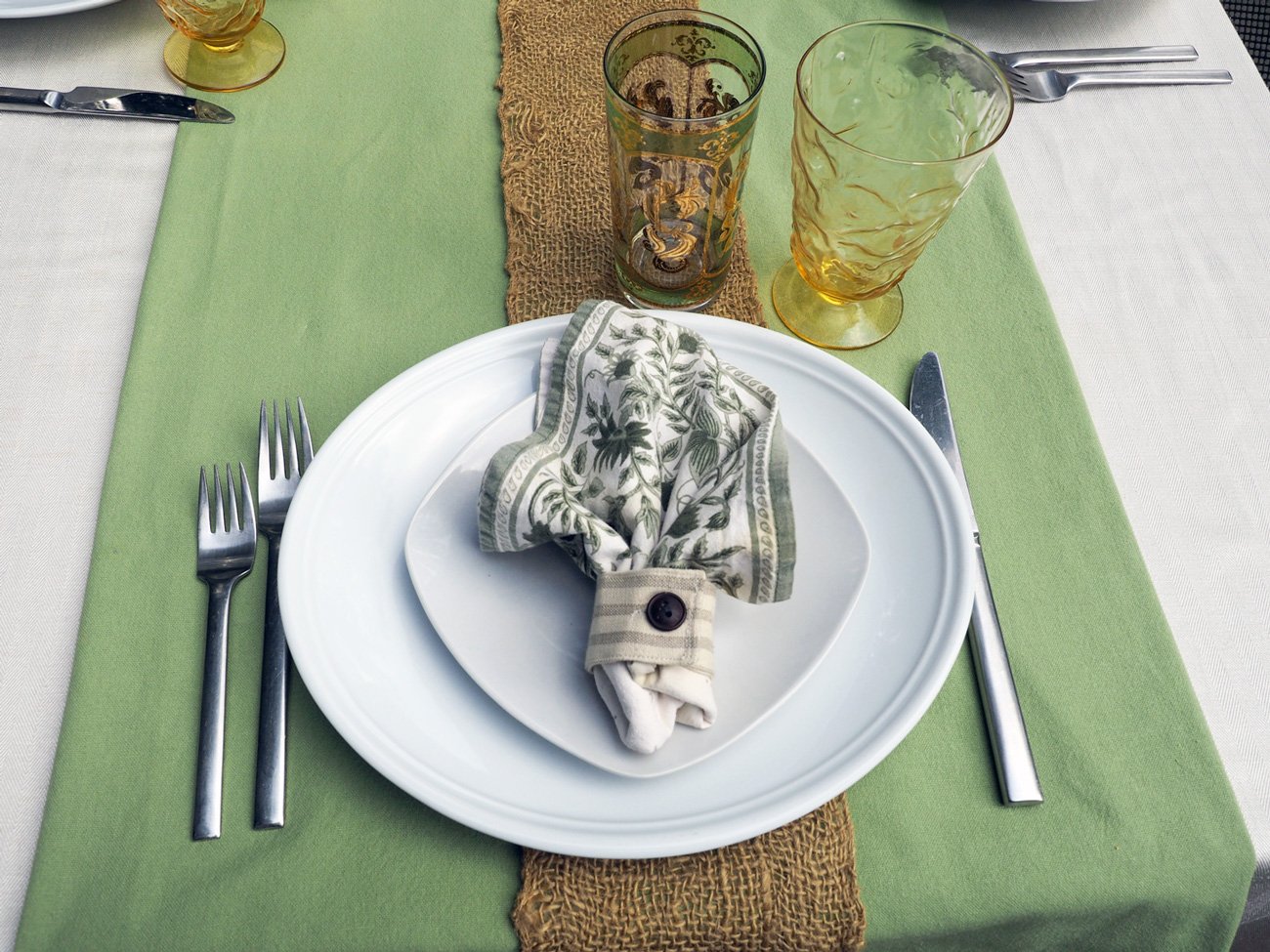
When it came to the place setting I kept it simple, clean and straightforward with pure white plates, silverware in their traditional positions with napkins in the center on top of the salad plate.
The place setting
This was a garden party so I didn’t need an elaborate napkin fold but wanted to mimic the fleur de lis pattern of the glassware.
I achieved that by folding the napkin in a square, tucking under one corner, then pinching the bottom together and finally securing it with a cloth napkin holder. Not hard, not too fancy but just enough flare to tie in the floral notes.
I like collecting vintage glassware and then pairing them together to create whimsy. I added two types of glasses, one for lemon/mint water and the other for homemade Jasmine iced tea with rosemary simple syrup. Of course, we had wine glasses but those were filled and handed to the guests upon arrival. Keep ‘em smiling from the onset.

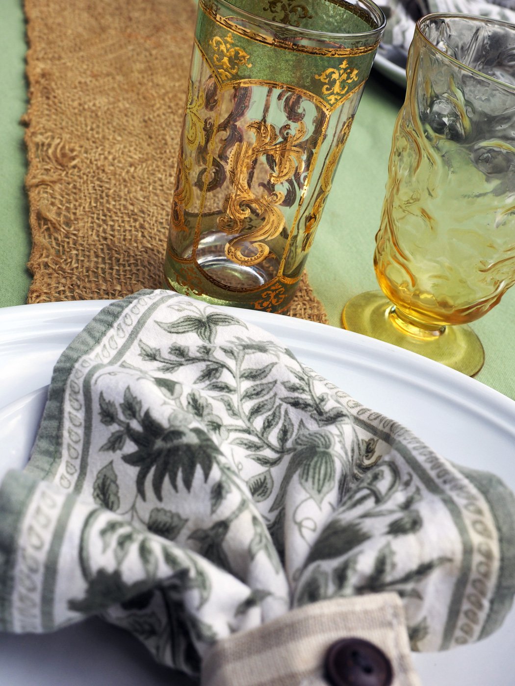
Floral swirls on the yellow glasses, gold floral swirls on the green glasses with floral napkin to match.
Lastly, I cut some rosemary from my garden and laid a sprig in front of every place setting. I mainly did this to help keep the mosquitos and flies away as they don’t dig the smell. But I also loved how it added another hue of green and played into the florals of the napkins and glassware. Such a simple touch that everyone noticed and commented on.
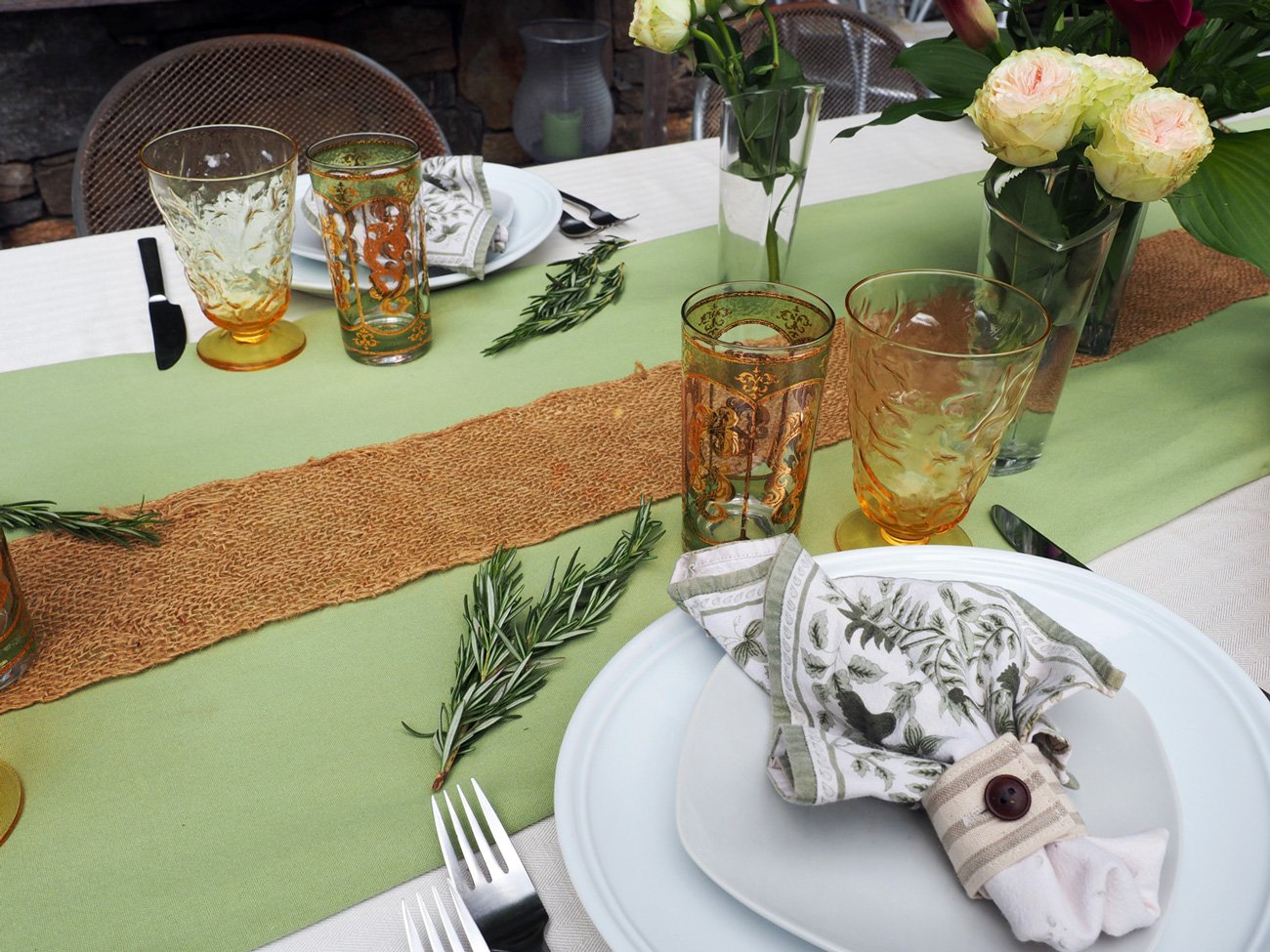
A sprig of rosemary finishes off the place setting with an added touch of green and natural element.
One final tip in the mise en place category, which I know I have mentioned before but bears repeating. Review the menu, then choose and have at the ready all the serving platters and utensils for each of the dishes. This may seem like an overly obsessive planning piece but I assure you it is a stress reliever. The last thing you want as you are about to serve up the food is to scramble around opening cabinets trying to figure which platter is big enough or deep enough or the right color. Trust me, it’s a small effort prior that pays off on the day of.

This was a simple table setting but I was pleased with how it turned out. It was low key yet still pulled together. And although not fully cream, it was calming just the same.
You can take this same set up and swap out the green runner for any other color and then just spin the color wheel to find your accents. Check out the link below with a major color wheel choices.

Color Wheel Fun
Opposites attract. This wheel gives a wide range of colors and tones that can be used when creating your table scape. If you want complementary colors, go opposite. If you want to stay in the same family go for an ombré effect. So many possibilities. Have fun.
Keep it simple, keep it pretty. Keep your guests feeling welcome the moment they walk in. Happy al fresco entertaining.