
To say I was nervous about hosting a small dinner party during the pandemic would be an understatement. I know most people have ventured into this territory many moons ago, but JuanCarlos and I have been super cautious. And rightfully so, since we know plenty of people who have had COVID, some of whom we were attempting to meet with until luckily we found out their positive status prior to gathering. We’ve had a few of those close calls so you can understand our hesitation. Thankfully, everyone we know has recovered and is fine.
With our caution has come both a sense of safety and a deep sense of isolation. Therefore, it was time to step out of our shell, out of fear and into joy again. And so we did. And indeed joy we felt. I spent the day preparing food and thinking about a table setting. (Well, it only took me that long because I had to stop to photograph everything, not because I made a feast.) Even though our dinner party total would only amount to 4, I wanted to make it feel a bit elegant and momentous given it would be the first time I’ve set our dining room table in over 2 years!! It’s the dead of winter here in NY, and the temps have been frightful. I have plenty of tablecloths that evoke Spring and Summer, even Fall vibes. But oddly enough not as many for Winter. I wanted the setting to be appropriate for the temperature but not feel cold.
I settled on a very graphic green and black table cloth that set a strong tone. Next was figuring out all the other elements that would complement without becoming overwhelming. Believe it or not, I had a hard time deciding on what napkin to choose. And that is saying a lot since I have a fairly large collection of napkins.

Please, no judgement. I’ve collected these over the years. And pre-pandemic, we entertained ALOT.
The black napkins seemed like an obvious choice but quite frankly there was plenty of black in the main cloth. Plus they wouldn’t have added anything to the party in the way of color dimension. White was clearly too stark and didn’t blend at all. Orange, as you can see, was way too shocking and garish, and would have been too many strong colors competing. Sometimes choosing a napkin is instantaneous, but this time around it took some thinking.

The orange and white ones felt too harsh of a contrast to me. The black might have worked but just felt Blah.
I landed on a multicolored stripe cotton napkin that softened the tablecloth’s intensity and added a whimsy of muted colors. Even though these napkins tend towards a springtime feel, their tonality was the ideal softening agent. To bridge that creamy base color in the napkins I decided to include a soft beige placemat.

Like Goldilocks and the Bears. This choice felt “just right”.
Since this was not going to be a formal dinner party, but an easy Saturday night with my sister, Alyssa and brother in law, Peter, no charger plates were needed. But a little bling was essential. Choosing white plates with a gold rim would help with that. Now that gold was introduced, adding the votive candle holders that I hand painted would finish off that golden touch.

Yes, those are OUI yogurt jars that I saved and hand painted with gold. I have a ton in silver too. I like how the design works with the movement of the tablecloth. Happy coincidence.
Votives provide a lovely low light glow, but I also like height. Which brings me to the candle sticks. Simple cut glass would add the height I wanted and also some sparkle without pulling attention away from everything else going on. Ugh, but now what color candle stick??? I must be out of entertaining practice because these decisions usual come to me in a flash. However, I do think showing this process helps to serve as a great demonstration of how a simple choice can change a look. And that there are no wrong decisions here. Just preferences. I had several choices; greyish silver, maroony purple, yellowy gold, or green. I chose the yellow gold, but any one of them would have worked just as well.

I might have immediately chosen the green since it was a perfect match, but for some reason I only had one.
Ok,
Tablecloth, check
Napkins, check
Napkin rings, check
Plates, check
Glassware, check
Candles, check
Let’s set a table…
When using placemats, sometimes I like turning them in other direction so they don’t cover as much of the tablecloth.

Gather all your elements. Once you see them all together the picture becomes clearer.
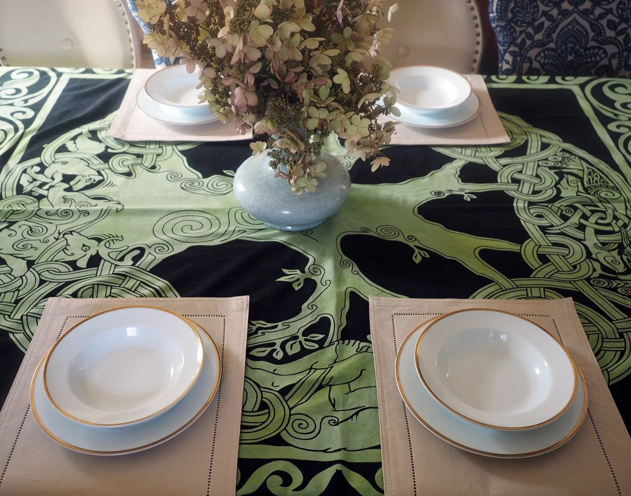
First layer down. I started with all the place settings in the center of the table, but right before our guests arrived I rearranged the seating.
To add some additional height, I went vertical with the napkin. Using a simple napkin ring and pulling the center of the fabric through to create an octopus-like vibe. It’s super simple but makes a visual impact.

This is a simple napkin style. For more options, check out my post entitled: Napkin Folding - 5 Basic Folds - Countless Options

I wasn’t serving any fish or seafood, but I did think the napkin resembled an octopus. It created the height I wanted and was playful.
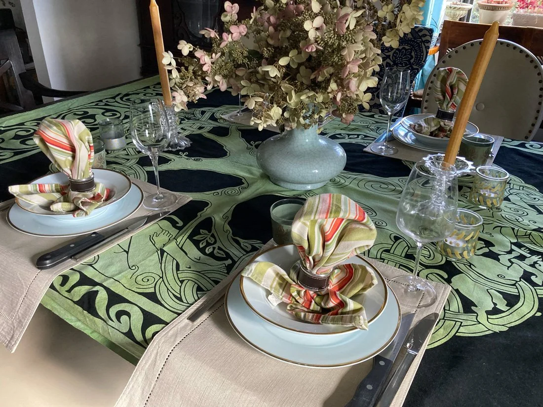
I love how the whole table came together. It’s elegant but not fussy.
Finish with silver and glass ware, some florals and my first in-house pandemic table setting was in the books.
Some random thoughts:
I absolutely love the movement of this tablecloth. The big, graphic swirls are so eye catching. When you take in the whole print from above, with the flowers perfectly centered, the roots of the tree really come alive.

I also adore the details of this print. Every time I see the figures on this cloth I can’t help but to think of the famous Robin William’s line in The Bird Cage: “Who sets a table and doesn’t look at the bowls?” For those who know and love this movie, no explanation is needed. For those who don’t, I implore you to watch this very funny movie.

I hope this has inspired you to take a chance on setting a table with a super bold, very graphic, intensely strong tablecloth print. With the right complementary elements It can be fun and is sure to make a statement that will impress. The first thing my sister said was, “Wow!” Unlike me, who is clearly very wordy, she is a woman of few words, but in this case, only one was needed.

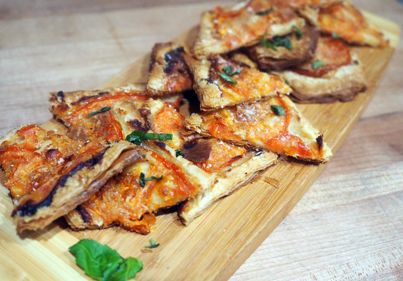
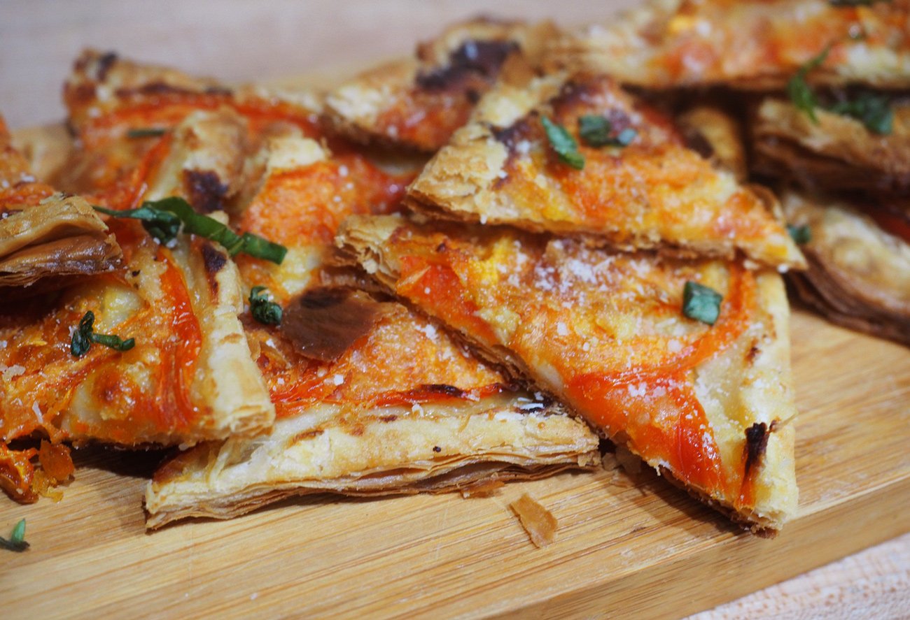
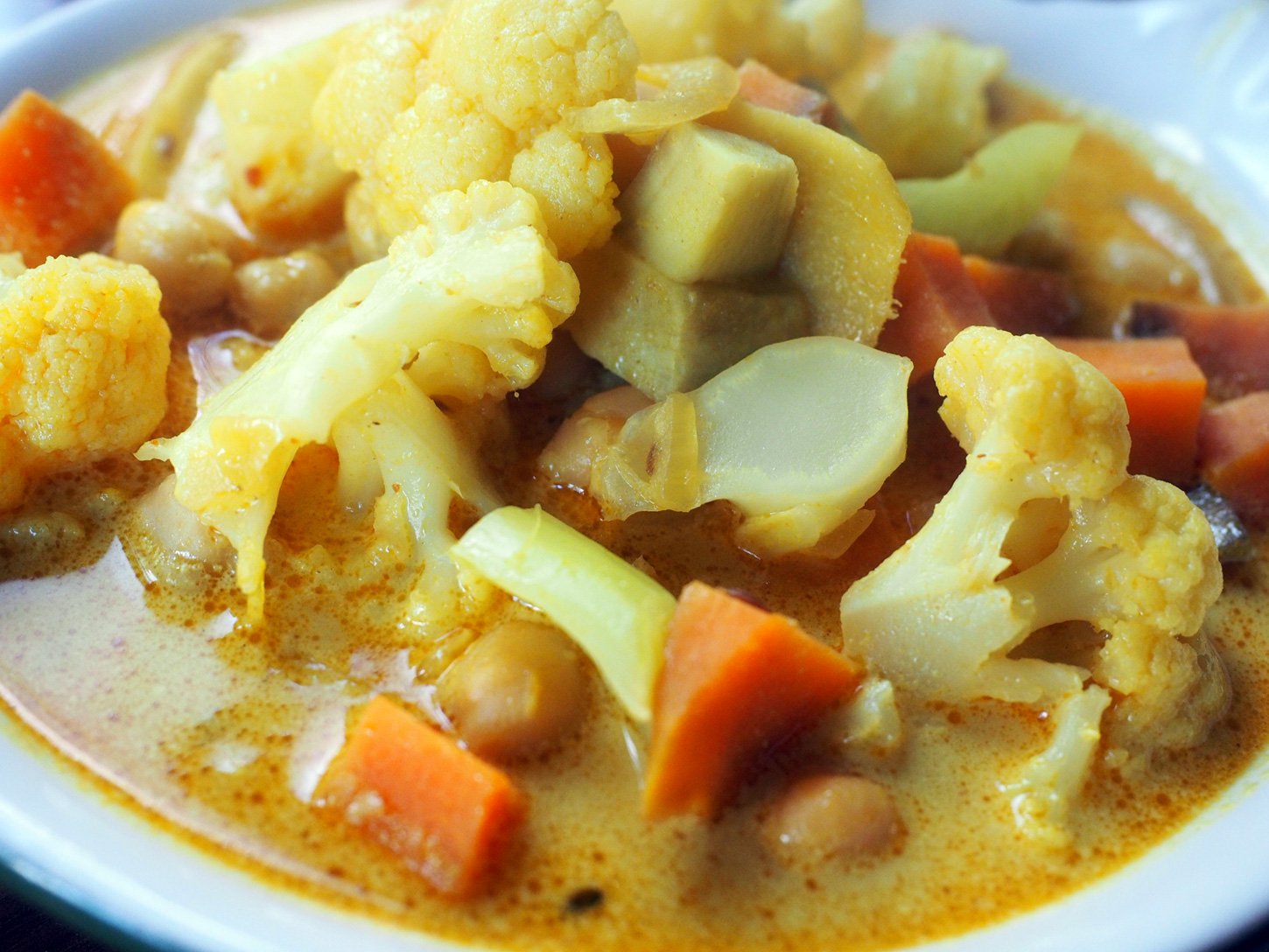
And in case you were wondering what we served… Here are a few images, and the menu.
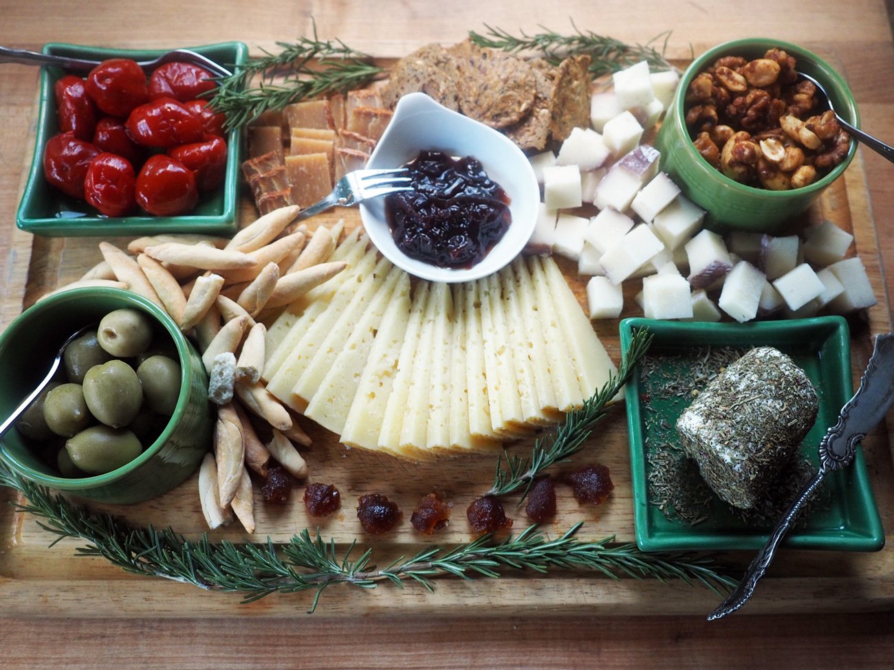
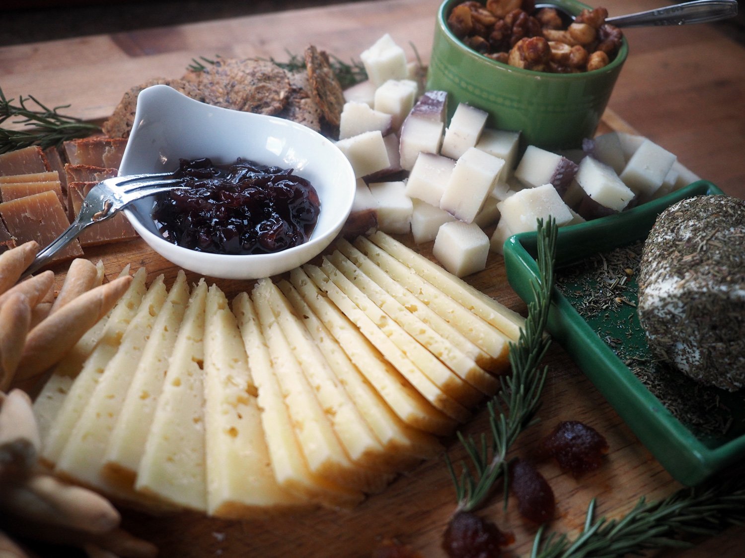
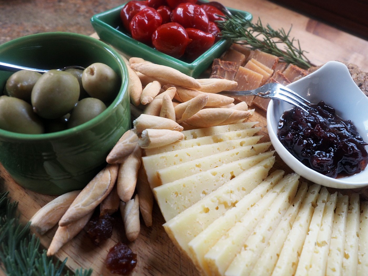
Cheese Board
(Hot Peppers, Olives, Mini Bread Sticks, Majorero Pimentón Cheese, Mary’s Gone Crackers, Murcia al Vino Cheese, Dana’s Nuts: Spiced & Candied, Goat Cheese with dried herbs, Jammin’ Onion Jam, Manchego Añejo, Apple Paste)
Tomato Tartlet
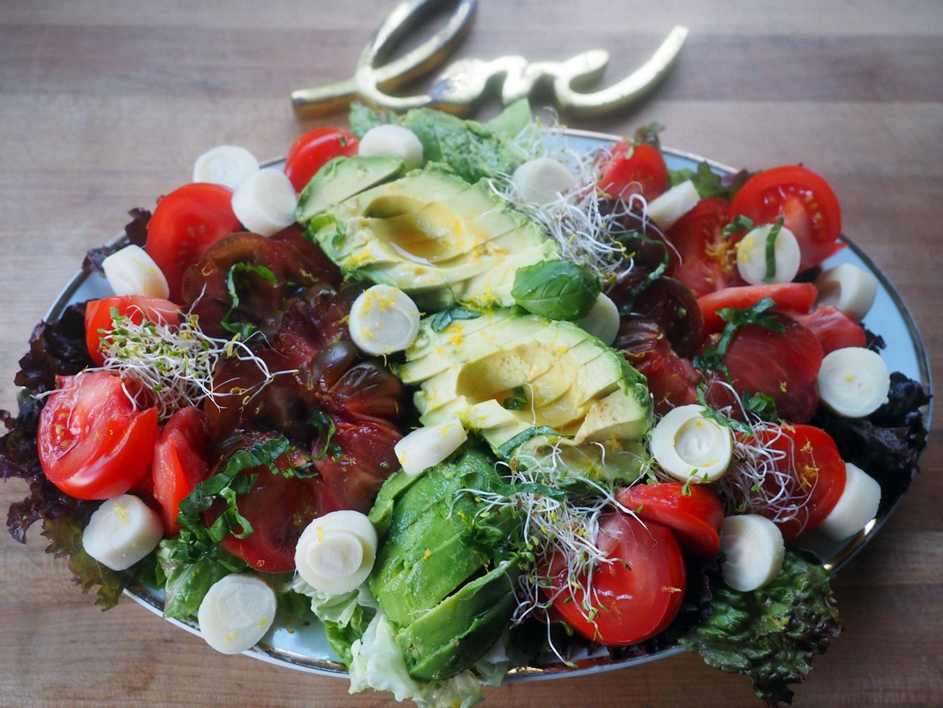
Tomato/Avocado/Hearts of Palm Salad
Cauliflower, Sweet Potato & Chick Pea Curry with Basmati Rice
Roasted Spiced Carrots & Onions
Oven Roasted Chicken
Apologizes, I didn’t take photos of the last two items to share.